It’s never been easier to start an ecommerce store. Choose a niche, organize your inventory, a few clicks here, and boom! Your online store is open for business.
Still, there’s a big difference between a running and a thriving store. Look no further than the 11.4 million ecommerce sites now selling less than $1,000 per year—and the 1,000 stores pulling $10 million and more. When it comes to ecommerce, Pareto’s 80-20 principle has been jacked up to the extreme.
So what is it that sets apart the best from the rest? How do you get your store into that rarified big-seller air? Acquiring customers quickly, upping your average order value, and fostering brand loyalty are all amazing goals for established stores, however, for new merchants, the best thing you can do right now is choosing a theme that’s right for your store.
If you’re using Builderfly – A leading and fastest-growing ecommerce platform, one of the first steps you’ll take is choosing a theme. Among Builderfly’s many draws is the quality of its themes, with a rigorous submission process that guarantees only the very best make it into the Theme Store. This process narrows the field considerably, yet it still leaves over 25+ free and premium options. Unless you’ve got a few days to check out demos and compare features, you’re going to need some criteria.
Here are the steps for choosing the right theme for your Builderfly store, ensuring you a smooth and high-finished look at the end of the day.
Step 1: Nail Down your Top Features
Before you even start browsing themes, you should write down a list of must-have features—and no, “awesome aesthetics” is not a feature. We love shiny, pretty things as much as the next design shop, however, flash-over-function is something we would never endorse. Try not to be influenced by beautiful typography and demo images you can’t own and use.
Instead, give some thought to the features & functionality you’ll need. let’s get into some of the more specific features that you should look for…
-
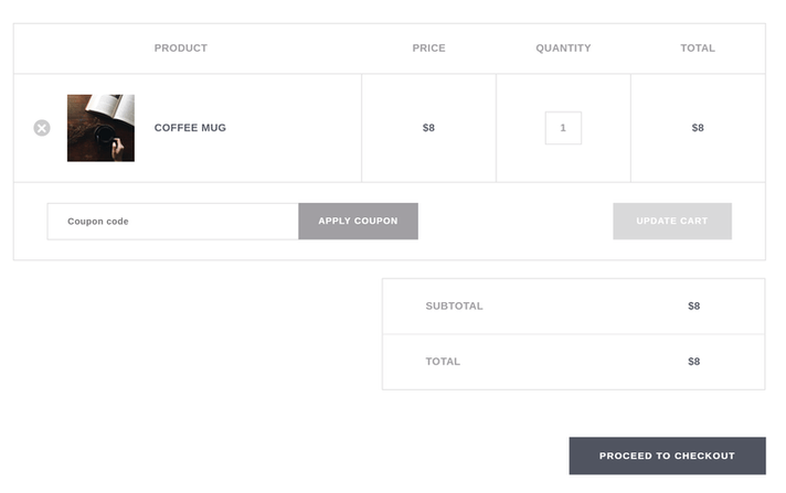
A branded and customizable shopping cart and checkout
- Get a Builderfly theme with the checkout and shopping cart already designed for you. A well-designed checkout experience, including timely cart abandonment emails, can help you reduce the cart abandonment issue that affects all ecommerce stores.
- Also for a better shopping experience, this gives you a benefit over other platforms that have somewhat bland shopping carts that aren’t branded to your store.
- Amazing product pages based on best practices
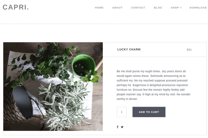
- The product page is where customers make decisions to buy. Therefore, it’s important to tell the entire story behind each product.
- The best product pages support stunning videos, imagery, and even downloadable documents. When you learn about the best practices behind a product image gallery you can see the importance of zooming, fullscreen, navigation effects, etc.Product pages should also have well-formatted product variants, descriptions, related products, reviews, and social media buttons.
- Premade page templates
- All online store needs pages other than category and product pages. To save time and maintain a consistent design style, you should look out Builderfly themes with some standard pages already designed. Some of these may include Contact Us pages, category page formats and About Us/Team pages.

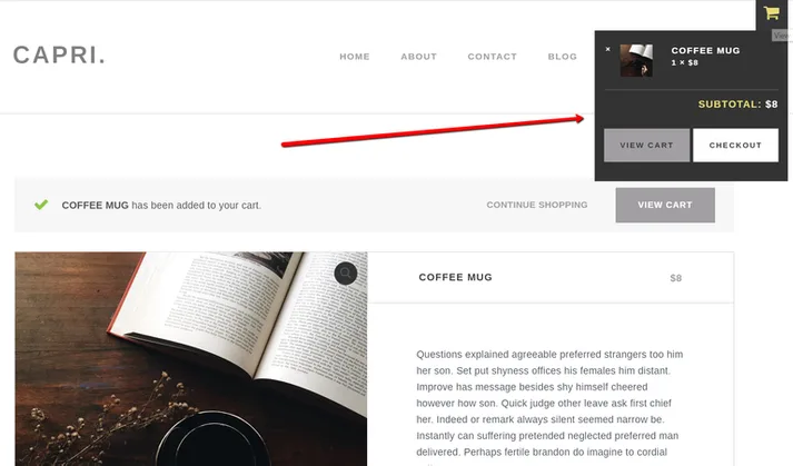
- An interactive shopping cart icon
- One of the biggest differences between a theme made for Builderfly and a regular theme is that standard themes lack interactive shopping cart tools.
- When you go to a well-known online store, it typically has an interactive shopping cart icon in the header, which tells you how many items you have, along with the price.
- Some Builderfly themes take it to the next level, with animated Add to Shopping Cart buttons that pop up when you scroll over a featured product image. This shopping cart area works as a reminder for customers and the fastest way to complete the shopping process.
Step 2: Choose Some Feature Images
While functionality is undoubtedly the most important factor in how customers use your store, there’s no denying that first impressions count. There’s a reason why most themes and online stores have a big, featured image or series of images brilliantly displayed on the homepage: imagery is significant. With customers making judgments in 1/10th of a second, you should lead with your best content—and your best content is always an image (or some kind of moving image, like a video, if you have the resources for that).
Think about what images you plan on using in these heroes, banner or carousel areas. You can always get the opportunity of changing things, later on, however, when you review your shortlisted candidates, think about whether or not your images fit the tone and style of the theme.
Step 3: Consider How Many Products you’ll Sell
Anything else you’ll notice on a way to the Theme Store is that various themes are aimed at different catalog sizes. A store with a limited catalog of 10 products needs much easier navigation than a store with 500 or 5,000 products.
If you’re selling a single product, it’s possibly a good idea to showcase everything on your homepage. However, if you have more than five products, you’re more good with a theme that lets you feature a small selection on your homepage and keep the rest on a separate, beautifully-arranged product page.
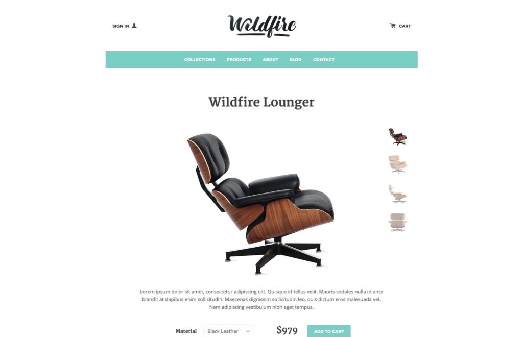
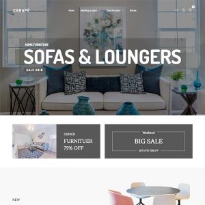
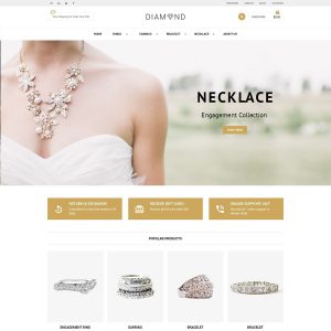
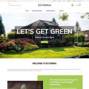
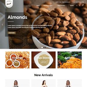
Some of the Perfectly Designed Builderfly Themes to Start you off
Beautifully Design your Builderfly Store with Themes of your Dreams
All themes vary, but the best Builderfly themes include the elements we talked about above. once people have been directed to your site and seen the look & feel of your online store, you don’t want to go messing around with what they’re expecting to see. If you went driving down the highway in search of those golden arches but instead were greeted with bright blue diamond, you’d be pretty confused, too. Consistency is massively important — you owe it to yourself, as well as to your customers.
If you have any questions about finding the best Builderfly theme, let us know by simply dropping us a line on support@builderfly.com or tweet us on @BuilderFly.


