A positive shopping experience can mean the difference between a shopper purchasing from you or one of your rivals. What’s more, how you present your products has a big impact on your customers’ shopping experience.
Take these two products for example
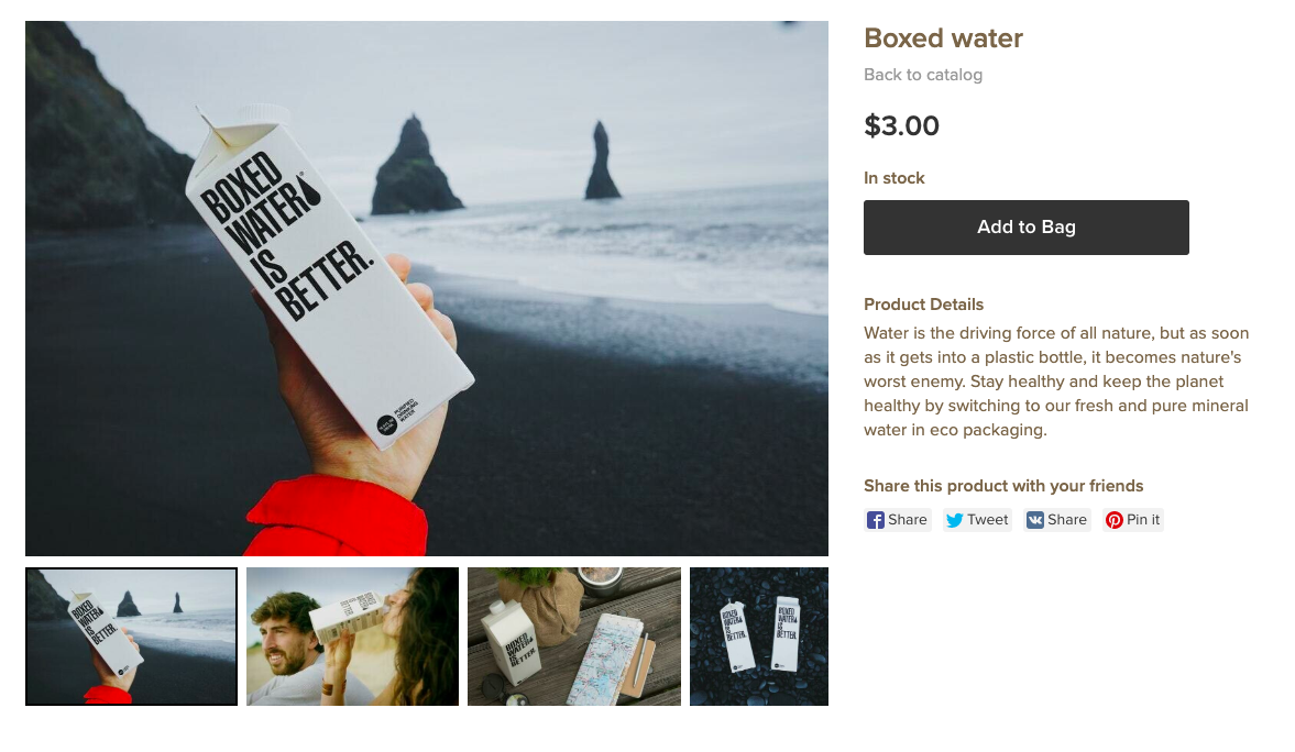
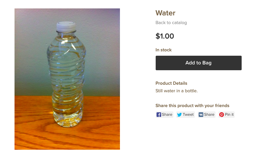
The first product is cheaper — and you can clearly see it’s water — but at the end of the day, it’s just not that appealing. The second option is more expensive, and there’s no earthly way of knowing if there’s actually any water in that box… but it’s trendy, the text is engaging, and goshdarnit if those photos aren’t cool.
If you’re placing an order for your H2O online, we’ve got our cash on the boxed water.
Two functionally identical products, and yet, one is inherently more attractive than the other. And that’s the real power of presentation.
Read on to learn some of our best presentation tips to make your products increasingly attractive to your customers.
Put Your Best Products Forward
There are two types of customers who visit your storefront: those who know what they want and those who don’t.
When a customer visits your store for the first time, it might take them a minute to search out where to start shopping, particularly if you have many product categories. Make it easier by showcasing your best-selling products on your landing page.
You can also add products to your homepage using Buy Now buttons (see picture below).
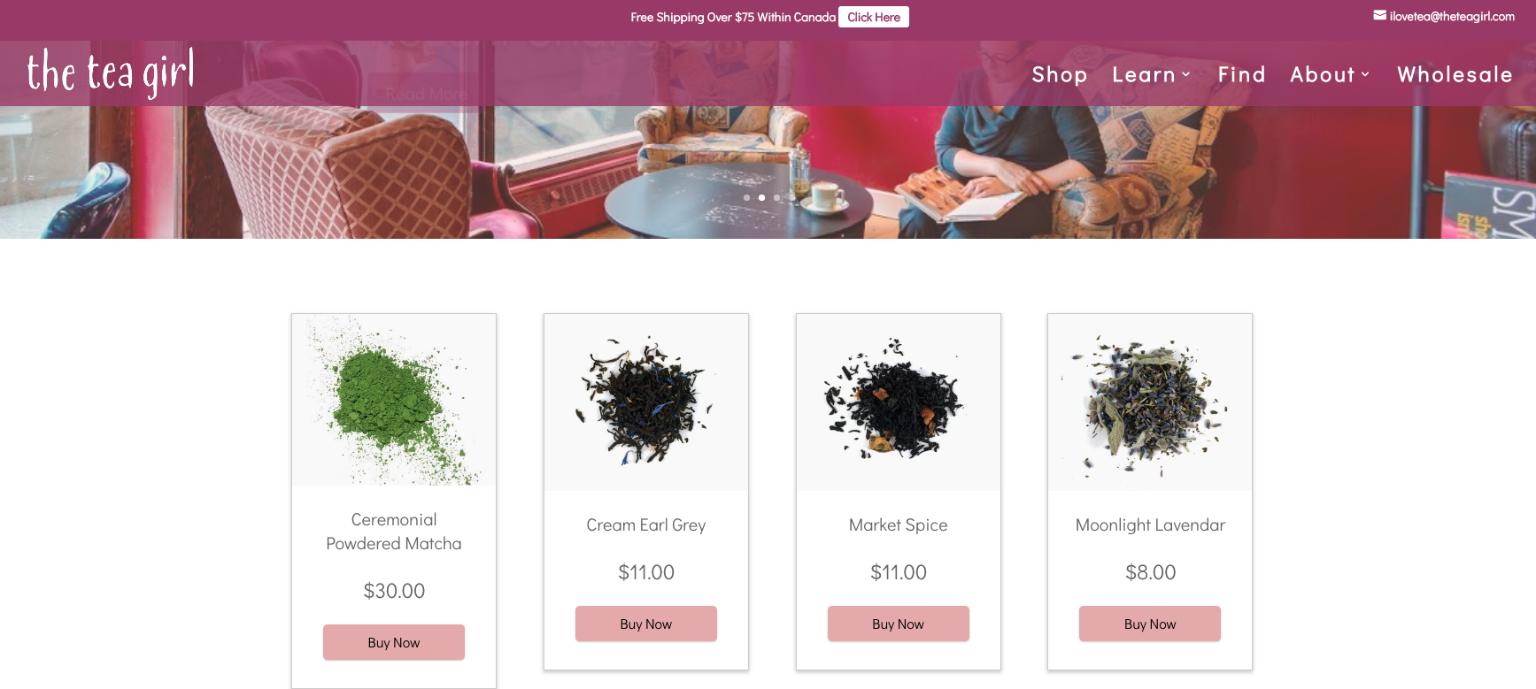
If you sell on the Builderfly Site, add “Featured” products on the store homepage to call out specific products.
Educate Your Customers
Sometimes people won’t buy a product because they’re not sure it’s the right solution or how to use it. If you sell something complex (a three-step skincare program), innovative (a wireless endoscopic camera), or multi-purpose(a transformer coat), it’s important to teach your customers how to get the most out of it.
Complex products can be tough to sell, however, their features are additionally an endless source of content. A similar way Builderfly offers tips and tricks on our blog, podcasts, and videos to help merchants do more with their ecommerce stores, you can show your customers how to maximize your products as well. Shoot a couple of YouTube video tutorials, add step-by-step guides to your product descriptions and write a blog. Anything to help your shoppers feel confident and empowered when they utilize your products.
Take Good Great Photos
Unless you’re selling actual garbage (and even then, you might want to think twice), product photography should be your top priority.
While it pays to hire a professional photographer in some instances, it’s not the ultimate determinant of success. You can also read our article on basic photography tips to get started, yet here are a few thoughts to keep in mind:
- Ensure your photos reflect how the product looks like in real life.
- Have one main picture with the best angle of your product, yet add at least 3-4 different pictures for customers to scroll through. When you make a product in your Builderfly store, you’ll see hints on flattering product angles to get you going:
- Standardize the background color to mix in with your storefront theme.
Use a Flattering Storefront Grid
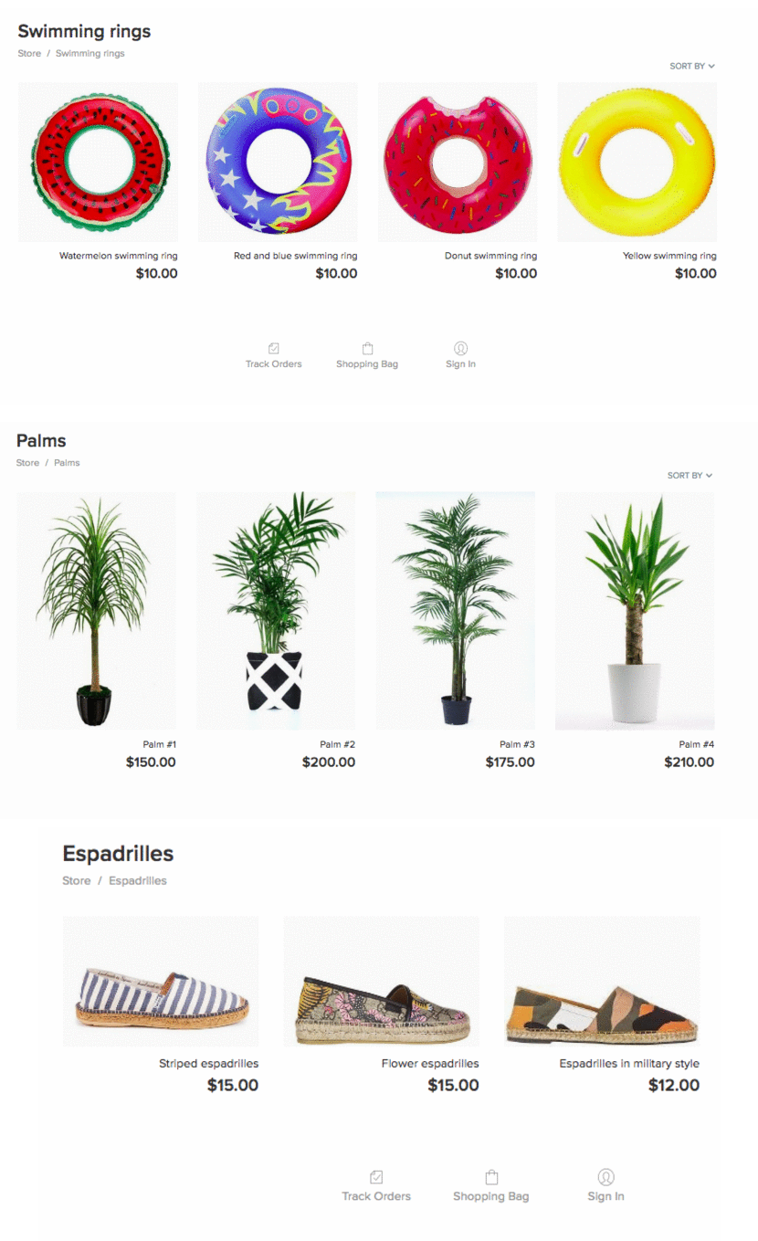
The human brain desires order and online shopping is no exception. Customers need patterns. Logic. A simple, discernable way to effectively digest data about your products. So help your customers find want they want quickly with a clear, organized online storefront.
A simple square grid can do the job fine and dandy. But what if you adjust it to the ratio and size of your products?
Just like brick-and-mortar stores arrange t-shirts on shelves and long coats on hangers, your Buiderfly store has the right display arrangement for your items. Big or small, vertical or horizontal, the right storefront design can do wonders for your products.
Showcase Your Packaging
53% percent of customers agree that the packaging material represents the product quality. So not only does the product packaging need to be good — you need your store visitors to see it too.
You don’t require to invest in platinum air pocket wrap to have extraordinary packaging — simply try to make your packaging perfect. Use materials that are wonderful to the touch, similar to textile or craft paper. And keeping plastic use to a minimum in your wrapping can additionally add value to your brand.
To end this all up, your product presentation matters. Showcasing your products well with great images, packaging, formatting, and language is the key to delivering a shopping experience that converts your customers. So go on, delight your customers with some incredible looking products, and score a few deals in return.


