It is proved and said that you have only 10-12 seconds to draw your users’ attention before they leave your site and move onto the competitor. So, you need to make things work in those 10 seconds.
How are you going to catch your customer’s attention? One of the best and easiest way to attract customer is to place a good font style which can draw their attention. Every font represents a meaning and conveys a strong message to the reader.
Combining two different fonts can help you achieve your target and increase your readers.
Let’s find out more about font pairing and how it works.
What is a font pair?
A font pair is a combination of two complementary fonts that you can use to blend your branded assets. This pairing can go for the heading-copy and body-copy.
Heading copy is used when working on brochures, posters, invitations, website pages, etc. while body-copy is used to write bulk content.
The best practices and strategy on using the combination of two fonts can help you achieve readability, engagement, contrast and visual hierarchy for your brand.
Why your website font matter?
Just like words you place on your website, your font also matters as it communicates a message. The better way your message is conveyed to your customers, the higher it influences and encourages them to engage more with you.
According to the recent study, online users read only 26% of words on a page. This percentage may vary depending on the font style you use and how engaging your content is. Most users spend around 15 seconds on your web page; this means your “every word needs to be noticeable”.
This is where fonts come into the picture. A proper font style impacts your brand image in so many ways. A font style that does not represent your brand image is just like a cheating scandal. It takes away users’ trust and decreases loyalty. Choosing a correct font can help you draw relevant traffic to your business.
Psychology of typeface
There is a psychology behind how you choose a font. Various typefaces can change people’s moods.
Generally, you first perceive a font; then your brain activates those perceptual components such as weight, size, and spacing. After analyzing font, you start thinking about its relevance to your brand image. Does it fit your brand voice or not?
Once you analyze the font and style, your brain combines it into the collective meaning.
Picking up the right fonts
When you relate font with characteristics, it will be easier to choose. A brand image is built of many different features. Suppose you are an ad agency and need to develop a brand image. How will you make your brand image? By being creative, innovative and trendy? Maybe.
The same way you can think about fonts. Remember, when you consider being creative, you’re not only creative. You can be modern as well. Not all fonts go with your concept and idea. You may find a font which can have a combination of more than characteristic. Choose fonts that suit your brand and convey your design in a better way.
Why should you use Font combinations?
The font style choice has a considerable impact on your brand and visitor traffic. The pairing of fonts is tricky, but it can be very beneficial for your brand to convey the aptest message in the right way.
The combination of different font styles can look perfect on your website. Today, there are so many fonts available which any website designer can use to create new typefaces.
But, while selecting the right font pair, you must consider aspects like load time, design purpose and compatibility.
7 Perfect Font Pairing for Ecommerce
Here are a few examples of the popular ecommerce font pairing which you can use:
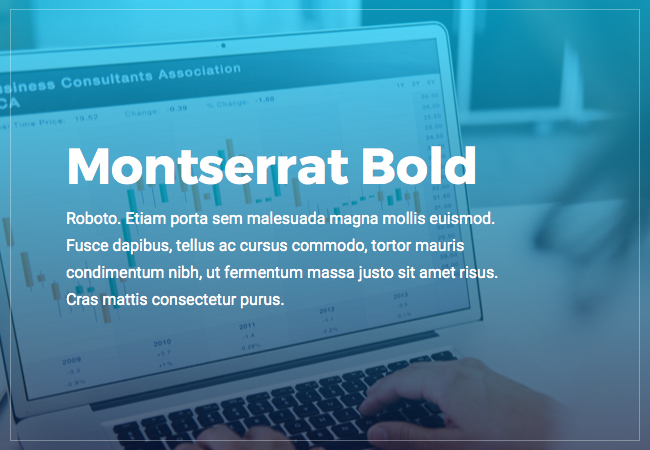
Montserrat Bold and Roboto Regular
Here we have created font-weight to create more contrast between two sans serifs fonts as they can not be the same. Montserrat Bold is quite a heavy font style than Roboto Regular. It works perfectly with lighter Roboto Regular. This font style can be used for ecommerce stores such as electronics or industrial parts.
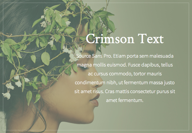
Crimson Text Regular with Source Sans Pro Regular
One of the most beloved font pairings is to combine one sans serif with another serif font. A Crimson text with source sans makes perfect classic pair. It has a calming effect on shoppers and can be used for ecommerce sites such as skincare, yoga, spa, and some other relaxation sites.
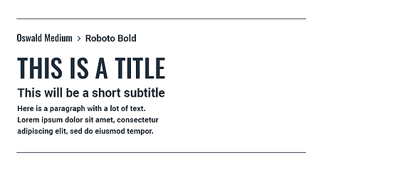
Oswald Medium & Roboto Bold
Oswald Medium can be used to craft a strong title font as it communicates quality with a bold weight and clean line. You can combine this font style with Roboto Bold. Google created it as the system font for its Android – mobile operating system.
It is suitable for the business, fitness, and technology industry.
Raleway and Roboto Slab
Raleway font can highlight unique characteristics of your brand with its minimalistic style, whereas Roboto Slab is different and has friendly curves that give a natural touch.
This pair makes an excellent choice for clean typography.

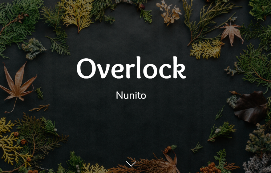
Overlock and Nunito
Overlock is used to creating great titles and short texts in magazine layout as it has a rounded glyph shape. It can look very nice, combining Nunito’s rounded forms.
This font pairing is suitable for sites selling clothes.
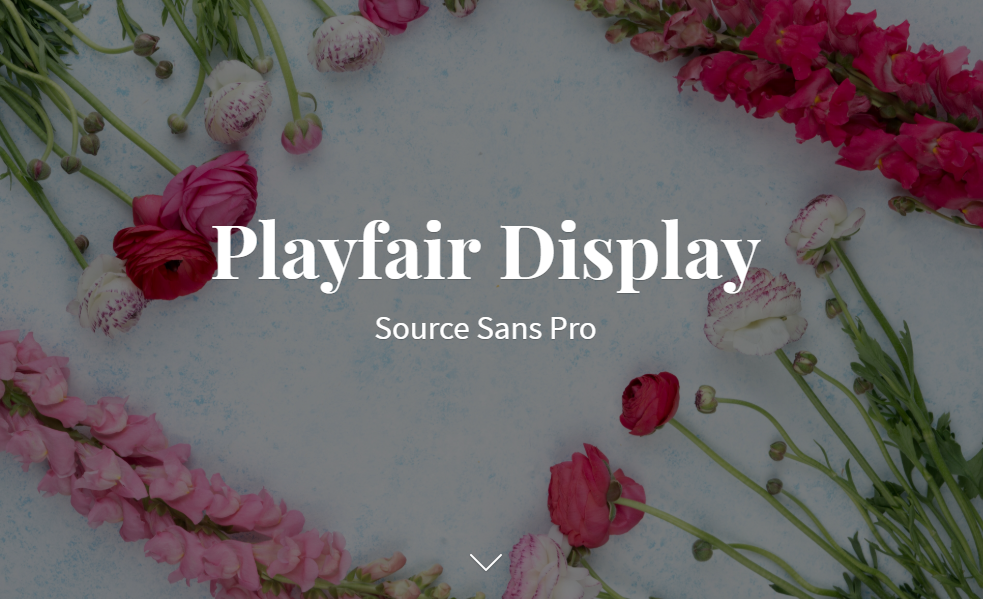
Playfair Display and Source Sans Pro
Playfair Display is more prominent when combined with Source Sans Pro. It is made to work well in User Interface. This amazing combination will work well with stores selling women’s dresses or beauty products.
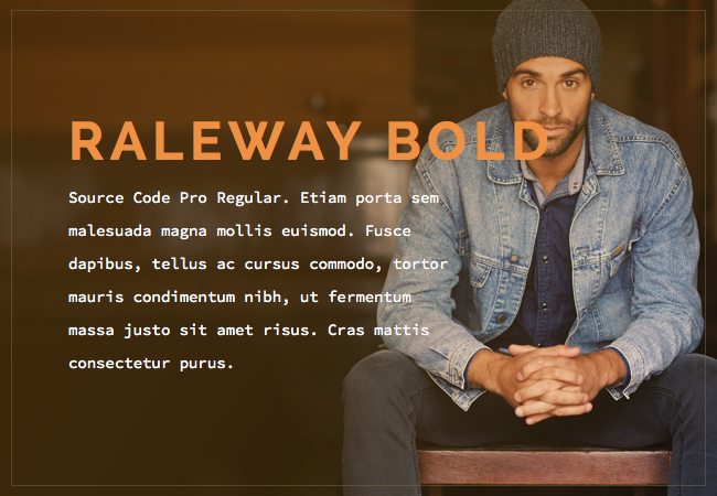
Raleway Bold and Source Code Pro Regular
A font pairing made up of perfect color, classification, size and weight along with Source Code Pro regular. The incredible combination of Raleway Bold and Source Code Pro Regular is best for the menswear product selling online store.
Tips on selecting the correct font design
Consider the following tips while picking up the ideal font design/style for your ecommerce brand:
- You should focus on the font style has the characteristics you need to represent your brand voice and image.
- Choose font personality wisely. Think about how you want to represent your brand and pick a contemporary, modern, minimalistic and progressive style.
- Decide your brand voice and genre. Based on the genre and subject, you can select a style. Be it romantic, elegance, beauty or vintage. The curve style can also be chosen well.
- Apply different font styles to each category. The various category represents different characteristics.
- You can also choose your font style based on your targeted audience and shoppers you want to attract.
- Your font style should be easily readable. Never comprise readability for a better design.
- You should also consider different devices when picking a font style. Your font style should be versatile.
Conclusion
As an ecommerce store owner, you should always be looking out for the new and unique font styles which you can pair to attract more traffic to your website. The examples as mentioned above can surely help you create the best font pairing for your website. You need not be a design rockstar to boost your site’s readability, just choose the right font style, which can correctly convey your brand’s message.
You can create different duos to work together. Take your time and look out the areas where you need to improve fonts on your ecommerce website.


